
Misconceptions and multiple-choice
More feedback on concepts students find easy and hard

Multiple-choice questions (MCQs) often get a bad reputation - with some justification. They often have quite artificial designs that don’t have much in common with real-world tasks. So there is always a risk that a student can do well on an MCQ test but this won’t tell you much about their understanding of the concept in question.
However, whilst this is a risk, we feel it is one that can be mitigated by a) good question design and b) statistical analysis.
Here are some examples of what we mean: three interesting insights from our latest batch of multiple-choice questions, on subjects and verbs. The first two insights are ones we predicted, and the third is one that we didn’t anticipate.
All these quizzes were taken after a short period of instruction in the relevant concepts. The data shown below is from one class, but is similar to the other 3-5 classes we are trialling with.
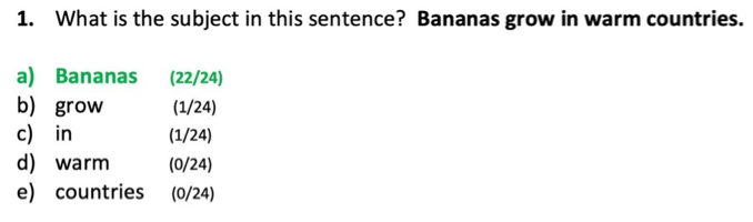
INSIGHT ONE: Students can identify subjects and verbs when they are in obvious positions at the start of sentences.
Here’s a question that most students got right. The subject is one word long and at the start of the sentence. Most students correctly identify it.
In advance of students taking this question, we’d written some pre-planned feedback for each wrong option. Our feedback for students who selected option C was the following.
Why might pupils have chosen this option? Pupils who chose this option might be very confused about what a subject is.
What could you do next? This is a very basic error, so try to follow up with these pupils immediately and repeat some examples showing that the subject tells you what the sentence is about.
Only one student chose option C, and their overall score on the test was just 4/10. So we feel that our prior judgement that this was a fairly straightforward question has been confirmed.
INSIGHT TWO: When the subject is not at the start of the sentence, students get confused.

With this question, four students thought that ‘at the weekend’ was the subject. We think that might be because they think the subject must always be at the start of the sentence. We wrote the following pre-planned feedback for option A.
Why might pupils have chosen this option? Pupils who chose this option might think that the subject is always the first part of the sentence.
What could you do next? Display this question, and explain that the subject is not always the first part of the sentence. The subject refers to the MAIN person or thing that the sentence is about. It can appear in any position in the sentence.
INSIGHT THREE: Students seem more likely to correctly identify concrete nouns as subjects, and less likely to identify pronouns as subjects.
Here’s an interesting example of a sentence where the subject is one word long and at the very beginning of the sentence – and yet the success rate is not very high.

We did not expect that distractor (B) would prove so popular. Our pre-planned feedback was as follows.
Why might pupils have chosen this option? Pupils who chose this option might think that the subject is always the first two words of the sentence.
What could you do next? Display this question, and explain that the subject is not always the first two words. The subject refers to the MAIN person or thing that the sentence is about. It can be one word or several words, and it can appear in any position in the sentence.
On reflection, we think this pre-planned feedback might be missing something. From further analysis of this question and others, we think that students struggle to understand that pronouns can be subjects. They are more likely to identify the subject when it is a concrete noun like ‘banana’ or ‘reindeer’.
We’ll continue to monitor this pattern and can update the feedback if needed.
Testing the tests
Statistical analysis can give us insights into student understanding, as we’ve just seen. But we can use the same analyses to give us insight into whether the questions are working as intended.
Here is a graph analysing question 10.
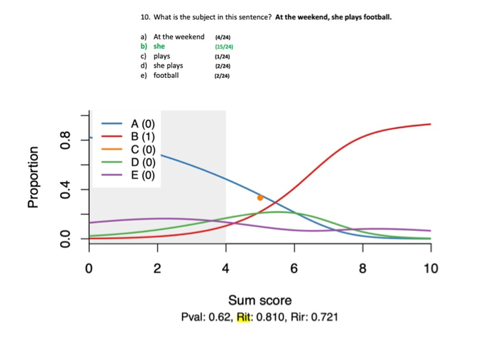
The x-axis shows you the total score out of 10 on the entire quiz, the y-axis shows you the proportion of students who got this question right, and the red line represents the correct answer, B.
The dot in orange is the student who chose C, who got 5 out of 10 overall on the quiz.
The green & purple curves are the students who chose options D and E.
The blue curve represents the four students who chose the most common wrong answer - option A.
So what is this graph telling us? You can see here that most students who have low overall scores on the quiz do not get this question right. The red line, representing the correct option, B, is low and then shoots up, showing that students with low scores get this question wrong, but that pupils with high scores get it right. This graph also shows you that students with lower scores overall are tempted by option A, but that students with higher scores overall are not fooled by this option.
When the curves for the right and wrong answers cross over like this, it’s often a sign of an interesting question that has separated the higher and lower performers. It feels like option A is a genuine misconception that is held by weaker performers but not higher performers.
Now imagine if the blue and red curves were switched around. That would mean all the students with high scores overall were getting this question wrong, and those with low scores were getting it right. That would be odd, and would probably be a sign that something was wrong with the question.
The graph above plots individual question score against total quiz score. We could also plot the individual question score against the total score on a different assessment - let’s say, the total score on a Comparative Judgement writing assessment. If we did that, it would tell us what kinds of individual questions are and are not associated with better writing scores. Stay tuned for more!